Remember when every Apple interface felt like you were living in someone else’s perfectly curated home? That era is officially over. Apple’s latest operating system updates have quietly introduced something that should make every design professional sit up straight: the ability to frost and customize Apple’s signature Liquid Glass elements.
Here’s what you need to know:
- Apple now allows customization of their signature glass-like interface elements
- This affects iOS, iPadOS, and macOS simultaneously
- Designers can adjust transparency, blur effects, and visual density
- The changes work across system apps and can influence third-party development
The Design Revolution No One Saw Coming
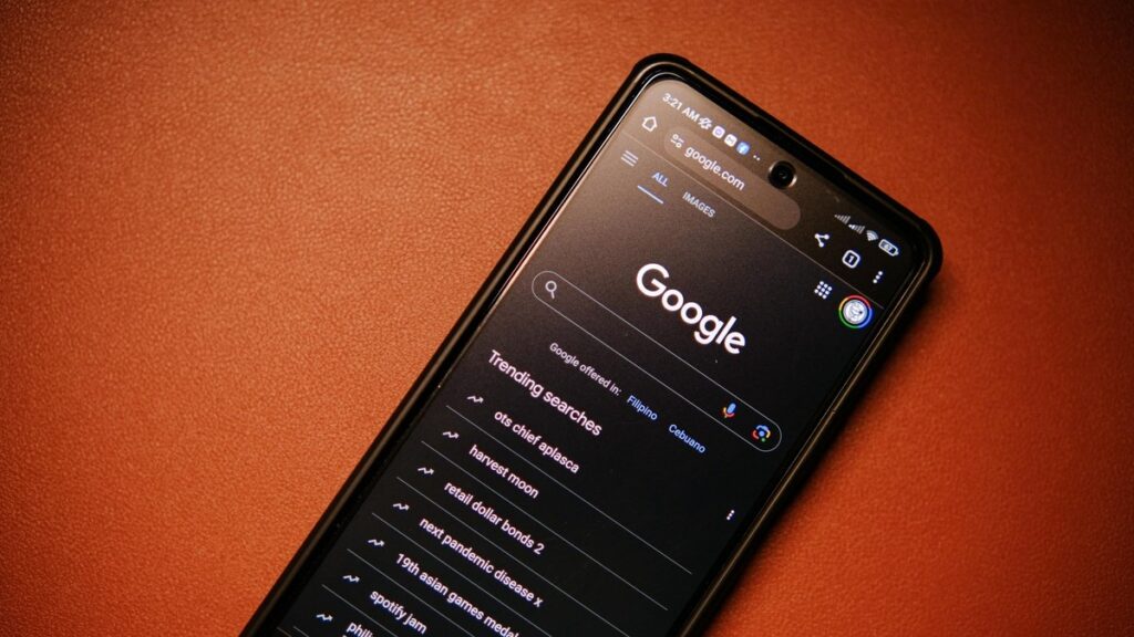
For years, Apple maintained tight control over their visual language. The frosted glass effect—what Apple internally calls Liquid Glass—has been a consistent design element since the early iOS 7 days. It created depth, hierarchy, and that distinctive Apple aesthetic everyone recognized instantly.
But according to The Verge’s analysis, Apple is finally opening up their design system in ways that fundamentally change how interfaces can feel and function. This isn’t just about letting users pick between light and dark mode anymore.
What makes this particularly significant is the timing. We’re at a moment where digital interfaces are becoming more personalized than ever. Users expect their devices to reflect their preferences, not just the manufacturer’s vision. Apple’s move acknowledges that one-size-fits-all design no longer works in a world of infinite customization.
What This Means for UI/UX Developers
If you’re building apps for Apple’s ecosystem, your design constraints just got significantly looser. The frosting capability means you can now adjust how much background content shows through your interface elements. This creates new opportunities for contextual design that responds to user behavior and content type.
Imagine a music app that becomes more transparent when you’re browsing your library but firms up when you’re actively controlling playback. Or a navigation app where directions become more opaque as you approach complex intersections. These subtle cues could dramatically improve usability without overwhelming users with visual noise.
As confirmed by Apple’s Human Interface Guidelines, these customization options maintain accessibility standards while offering unprecedented flexibility. The system automatically ensures sufficient contrast ratios and maintains readability even when designers push the visual boundaries.
Practical Implementation Strategies
For designers jumping into this new territory, start with subtle adjustments. The temptation might be to go wild with transparency effects, but the most effective implementations will likely be the most restrained.
Consider using increased frosting to indicate modal states or temporary interfaces. Reduce transparency for permanent navigation elements. Use varying glass effects to create visual hierarchy that guides users through complex workflows.
Beyond Aesthetics: The Accessibility Angle
Here’s where things get really interesting for professional designers. The frosting controls aren’t just about making interfaces prettier—they’re powerful tools for improving accessibility.
Users with visual impairments often struggle with busy backgrounds interfering with foreground content. By adjusting the Liquid Glass frosting, designers can create optimal contrast conditions for different use cases. A slightly more opaque version might help users with certain visual conditions read text more easily, while a more transparent version could reduce visual clutter for others.
The system-level implementation means these adjustments can work consistently across the entire operating system. A user who needs specific contrast settings can have them applied universally, rather than hoping each app developer implements similar customization options.
The Bottom Line for Design Teams
This changes your design system documentation. It affects your component libraries. It might even influence your hiring decisions as you look for designers who understand how to work with dynamic, customizable interface elements rather than static designs.
The companies that will benefit most from this shift are those who treat it as an opportunity to create more adaptive, user-centered interfaces rather than just another visual effect to play with.
The bottom line:
Apple’s Liquid Glass frosting represents a fundamental shift from rigid design systems to flexible, user-adaptable interfaces. For design professionals, this means unprecedented creative freedom tempered with new responsibility to create interfaces that serve diverse user needs. The companies that master these new capabilities will create the next generation of truly personalized digital experiences that feel uniquely tailored to each individual user.