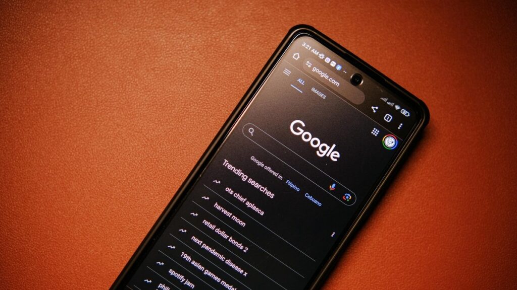
You probably open Google Photos or Maps multiple times a day without really thinking about their icons. But this week, something changed on your home screen. Those familiar solid-color icons have transformed into vibrant gradients that seem to shimmer with depth and motion.
This isn’t just another aesthetic tweak. Google’s latest icon redesign for two of its most-used apps signals a fundamental shift in how the company thinks about digital interfaces. And it’s happening right on your smartphone’s home screen.
Here’s what you need to know:
- Both icons now feature multi-color gradients instead of flat single colors
- The redesign maintains core brand recognition while adding visual depth
- This follows Google’s broader Material You design language evolution
- The changes are rolling out to Android and iOS devices globally
The Visual Evolution: From Flat to Fluid
Remember when app icons were simple, flat designs? That minimalist trend dominated mobile interfaces for nearly a decade. But according to Google’s Material Design documentation, the company has been moving toward more expressive, dynamic interfaces that respond to context and content.
The new Google Photos icon retains the pinwheel shape but transforms from a simple white pinwheel on colorful background to a multi-dimensional gradient that seems to flow through the icon. Similarly, the Maps icon keeps its location pin silhouette but now features a gradient that suggests depth and dimension.
What’s interesting is how these gradients aren’t just decorative. They create a sense of movement and energy that makes the icons feel more alive on your screen. When you scan your home screen quickly, these gradients help the icons stand out amidst dozens of other apps.
Why This Matters for Your Daily Experience
You might think “it’s just an icon,” but these visual changes influence how you interact with technology. The gradient design language creates subtle psychological effects that impact usability and engagement.
Research from Nielsen Norman Group’s usability studies shows that recognizable icons with distinctive visual elements improve navigation speed and reduce cognitive load. By maintaining the core shapes while enhancing visual distinctiveness, Google is balancing familiarity with innovation.
The gradients also serve a practical purpose in today’s crowded app ecosystems. With thousands of apps competing for your attention, distinctive visual branding becomes crucial. These vibrant gradients help Google’s core apps maintain visual prominence on increasingly personalized home screens where they might appear alongside countless third-party applications.
The Bigger Picture: Google’s Design Language Matures
This icon update isn’t happening in isolation. It’s part of Google’s broader Material You design system that emphasizes personalization, adaptability, and expressive interfaces. The gradients represent how digital interfaces are evolving beyond static elements into dynamic systems.
Think about how Google’s design philosophy has evolved. From the colorful but flat design of early Android to the sophisticated gradients we’re seeing now, each iteration reflects changing technology capabilities and user expectations. Today’s smartphones display millions of colors on high-resolution screens—designs that don’t take advantage of these capabilities feel dated.
The gradient approach also creates visual consistency across Google’s ecosystem. When you see these flowing color transitions, you immediately recognize Google’s design language, whether you’re looking at an icon, using an app, or browsing search results.
The bottom line:
Google’s gradient icon redesign represents more than just a visual refresh. It signals the company’s commitment to creating interfaces that feel more dynamic, personalized, and responsive to how we actually use technology today. While the core functionality remains unchanged, these visual enhancements contribute to a more engaging and distinctive user experience that keeps Google’s apps feeling modern and relevant.
Next time you tap that newly gradiented Photos or Maps icon, remember—you’re not just opening an app. You’re interacting with a carefully considered design system that’s evolving to meet the demands of modern digital life.


